Being in business for myself has taught me a lot in the past four years. Lately, I’ve been reflecting on being my own boss and how that has been helpful when I collaborate with others.
As a Sr. Art Director in Chicago, I worked with a team of creatives, account managers, and often the client directly. A lot of cooks in the creative kitchen! One of my past issues working with a team is that I used to be too precious with the projects. Often micromanaging and sometimes ignoring other voices in the room.
As the only employee of my business, I only have myself to blame if something falls short. This is also true of the successes. And, while I enjoy being a solo act, I often miss collaborating with others and sharing the joy of a project's success through a combined effort.
Now that I have had a few years to cultivate the Darren Vorel business, I look at creative collaboration in a whole new and exciting way. Below I’d like to share a couple recent collaborative jobs that I’m proud of.
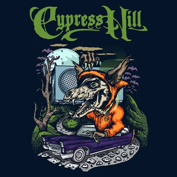
Cypress Hill - Haunted Hill
I was tasked with creating the official imagery for legendary American hip hop band Cypress Hill’s upcoming Haunted Hill shows. I came up with the original spooky art but worked closely with the band’s manager to get it on brand. This went through a few iterations to get it right. Originally I had the wolf’s brain popping out with a full on 70’s color scheme. I went to work re-drawing and re-coloring to get it just right and the final result turned out better for it.
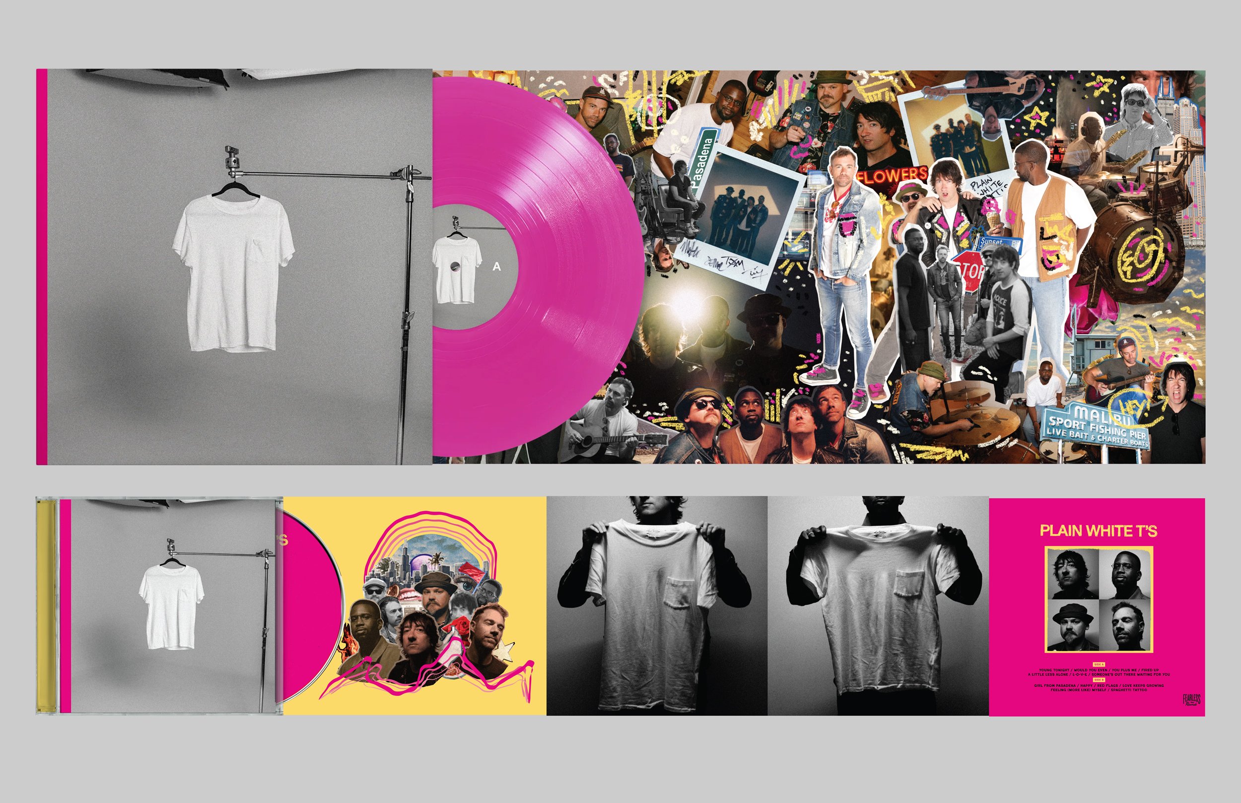
Plain White T’s - Self Titled
Late in 2023 I was asked to work with American rock band The Plain White T’s on a few projects. I went out to Chicago to capture photo and video of their hometown record release shows and before that, I was involved with the art direction and graphic design for their 9th studio album.
There have been so many intelligent folks involved in this undertaking. From management to photographers and the band itself. This was a true collaborative effort that has reverberated into much of the admats, merch, online materials and branding for the band as they continue to tour on this album cycle.
Bayside - There Are Worse Things Than Being Alive
I worked closely with longtime Bayside art director Jason Link to come up with a symbol for a series of E.P.’s that would culminate into a full LP release for American rock band, Bayside. I came up with the Mandala design and it has been used on the Red E.P., The Blue E.P., and the full length album “There Are Worse Things Than Being Alive.”
For the full-length album, we went around downtown Los Angeles and projected the Mandala on the sides of buildings. The photographer popped out through the sun roof and I held the generator-fueled projector out the back seat window while the art director drove around downtown LA. It’s of my most favorite memories creating art with a small but dedicated team. In the end, the band chose the still of me walking past the mandala for the cover art which was an added bonus for me!
Fry The Coop - Branding
I have been working with Chicago restaurant chain Fry the Coop ever since they opened their first restaurant in 2017. Joe, the owner of Fry the Coop has a focused idea of how he wants the restaurant to look and feel. It’s all about happiness. Over the years Joe and I have worked closely to build the branding for Fry the Coop. Some of the items include menu boards, sandwich wraps, merch, interior decor, and two official beers! It’s one of the best working relationships I have and I am very proud of the work we do together.
Thanks for taking your valuable time to read through some of my favorite collaborations. I hope you have some partnerships that keep you creatively fulfilled!
Darren Vorel


